Analysis of periodic data by R
Here, we explain three methods of analyzing data with periodicity: fft, difference, and autocorrelation.
You can see the same thing with these three, but sometimes you can see that they are different because the calculation method is different.
fft (Fast Fourier Transform)
spectral analysis
library(ggplot2)
setwd("C:/Rtest")
Data <- read.csv("Data.csv", header=T)
n <- nrow(Data)
ft <- log10(abs(fft(Data[,1]^2)))
Data2 <- as.data.frame(ft)
Data2$Index <- as.numeric(row.names(Data2))
Data3 <- Data2[2:floor(n/2),]
Data3$Wavelength <- n / (Data3$Index-1)
ggplot(Data3, aes(x =Wavelength, y=ft)) + geom_line()+labs(x="Wavelength",y="Power")
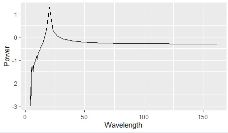
The output of fft is symmetrical up and down, and the lower half is unnecessary, so I deleted it.
Generally, the output of fft has the frequency (reciprocal of wavelength) as the horizontal axis, but when you want to see the periodicity of data, it is easier to understand by using wavelength, so we use wavelength here.
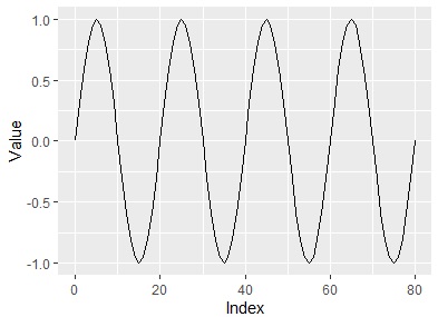
In the figure above, you can see that there are about 80 rows of data and there is periodicity every 20 rows. The original data is as shown below. Certainly, there are about 80 rows of data and there is a periodicity every 20 rows.
Advantages of Fourier transform
In the case of Fourier transform, unlike the other two methods on this page, it is not statistically processed. Therefore, it is possible to check the presence or absence of periodicity even in the case of a long wavelength that contains only one or two cycles.
Difference (difference from previous data)
This is a method to see the difference (difference) between the data before and after the data in the same column.
library(ggplot2)
setwd("C:/Rtest")
Data <- read.csv("Data.csv", header=T)
Data_diff <- diff(Data[,1])
Data_diff <- as.data.frame(Data_diff)
Data_diff$No <-as.numeric(row.names(Data_diff))+1
ggplot(Data_diff, aes(x =Data_diff)) + geom_histogram()
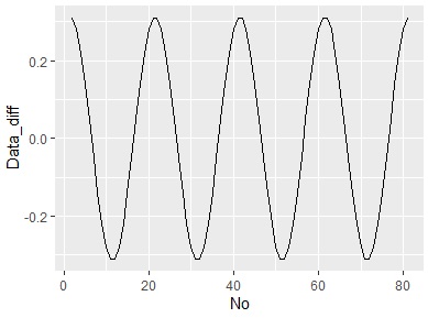
It is difficult to understand in this example, but if you make a line graph, you can see that it is a cos wave when you take the difference from the previous data with a sine wave.
ggplot(Data_diff, aes(x = No,y=Data_diff)) + geom_line()
Difference benefits
In the case of differences, all combinations of differences can be viewed directly as data, so changes in differences and distributions can be viewed.
Periodic analysis
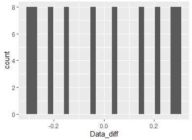
The data in this example has a periodicity every 20 rows, but let's take the difference every 20 rows.
By writing ", 20" in the diff function, it will be calculated every 20 lines.
library(ggplot2)
setwd("C:/Rtest")
Data <- read.csv("Data.csv", header=T)
Data_diff <- diff(Data[,1],20)
Data_diff <- as.data.frame(Data_diff,20)
Data_diff$No <-as.numeric(row.names(Data_diff))+1
ggplot(Data_diff, aes(x =Data_diff)) + geom_histogram()
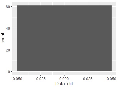
Since the difference is calculated every 20 lines, there can be 60 differences. Since the vertical axis is "60", you can see that all the differences have the same value. Since the center of the horizontal axis is 0, you can also see that all the differences are "0". Therefore, it can be seen from the difference that there is periodicity every 20 lines.
In this way, you can analyze the periodicity by looking at the difference.
Analysis other than periodicity
Since the periodicity is not known from the difference from the previous data, when analyzing the periodicity, the difference from the previous data is not seen, but the difference from the previous data can also be used.
One is how to use it as speed data . The difference from the previous data has a physical meaning of "amount of change per unit time", so it can be used when analyzing data from that perspective.
In particular, if the distribution of the difference from the previous data is random, you can consider a random walk model .
Autocorrelation
Auto correlation analysis is possible. For the same column, the data is shifted by one row, the data is shifted by two rows, and so on, and the result of calculating the correlation coefficient for each is obtained.
setwd("C:/Rtest")
Data <- read.csv("Data.csv", header=T)
acf(Data[,1])
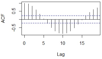
In this example, if you shift 10 lines, the negative correlation seems to be the strongest, and if you shift 20 lines, the positive correlation seems to be the strongest.
Cross-correlation
A typical correlation analysis uses data from the same row to look at the correlation between data in two different columns.
Cross-correlation adds the perspective of "shifting lines" to this analysis method. You can investigate the case that "there is a time delay, so shifting one column will increase the correlation".
setwd("C:/Rtest")
Data <- read.csv("Data.csv", header=T)
ccf(Data[,1],Data[,2])
#Examine the cross-correlation between the first and second columns
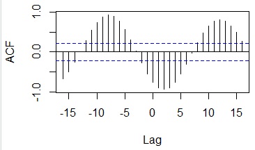
In the case of this example, it can be seen that the correlation becomes very high when shifting by 7 pieces.
Benefits of autocorrelation
With diffs, you need to look at one end to see how many rows you can shift to improve the visibility of your data. With the correlogram, this task is done in no time.
Benefits of cross-correlation“_
With the above difference and Fourier transform, it is not possible to analyze the deviation of two different columns.
